Shasta Regional Medical Center – Award-Winning Health Care
It’s not every day the opportunity presents itself to develop a campaign message for an entire hospital system. So, when the moment arises to help an organization dedicated to the health and well-being of a community, we are proud and honored to take on the challenge. Shasta Regional Medical Center is a 226-bed acute care facility that has been providing regional medical services for Northern California for more than 70 years.
Shasta Regional offers a diverse range of medical services from Emergency Medicine, Critical Care, General/Specialty Surgery, Cardiovascular Services, Neurosciences, Orthopedics, and Behavioral Health Services. Our outpatient support services include a Diabetes Care Center, Cardiac Rehabilitation, Pulmonary Rehabilitation, Wound Care Center, and Health & Wellness Center.
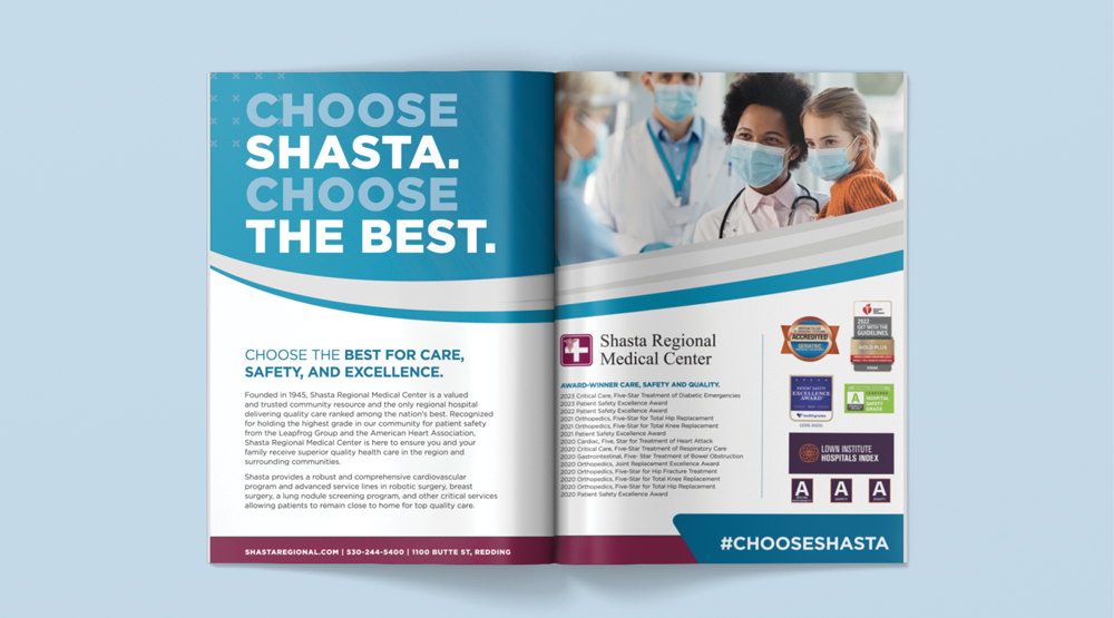
In addition to the Hospital’s wide range of capabilities, Shasta Regional is ranked as a 100 Top Hospital in the U.S. for the third year in a row and has twice been chosen as a 50 Top Cardiovascular Hospital in the Nation by Truven Health Analytics; Shasta achieved this recognition based on the performance metric of higher patients survivor rates, lower complications, reduced readmission rates, patient satisfaction scores, and another quality measure.
While Shasta Regional is proud to have earned National recognition, the medical center believes that real honor is vital in saving lives in the Northern California community. With a Mission of delivering compassionate, quality care to patients and better healthcare to communities, this annual campaign focuses on the medical center’s quality, care, support, and excellence every day. “Choose Shasta, Choose Excellence” is one of the primary brand taglines emphasizing the message that choosing Shasta is choosing superior care.
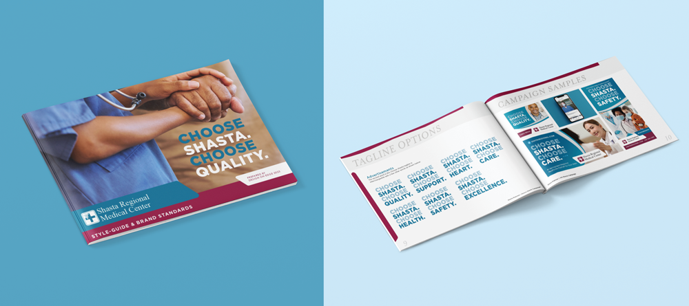
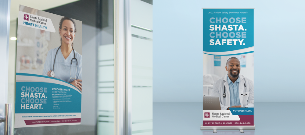
Using the original Shasta Regional Medical Center logo and signature Prime Healthcare System burgundy brand colors, we built on a solid base, adding blues and grays to symbolize trustworthiness and professionalism. When these colors are paired with the sturdy but kind nature of Gotham Black, the brand takes on a personality that conveys the quality characteristic the Hospital is known for.
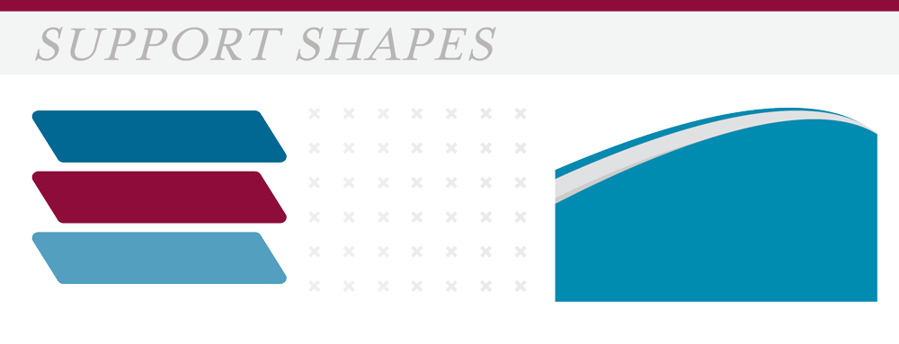
The support graphics helped the brand message with rounded edge shapes to show a gentle and empathetic approach, added to a light-to-dark blue gradient, showing the depth of trust patience has in Shasta Regional. Everything works together to show the confidence one can have in choosing Shasta.
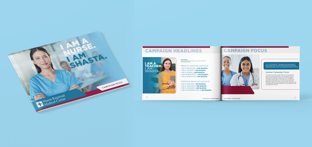
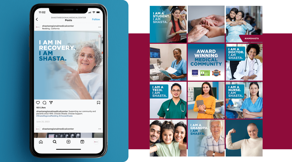
The Choose Shasta Campaign is another campaign that dives even deeper to connect with the audience. “I am Shasta” draws a connection to everyone in the community on a personal level by showing that the community makes Shasta. “I am a mother. I am Shasta” makes the connections to mothers, “I am a teacher. I am Shasta” connects to teachers, and “I am a student. I am Shasta” connects to students. Using all of these and more variants spreads the message that Shasta Regional is built by the community it serves.
