Design On Edge Rebrand

Four years ago, our creative team at Design on Edge embarked on a journey to rebrand ourselves. As with any industry, we know the significance of evolving and adapting to a changing world. We know we must continue to learn, grow, recommit to our values, and reorient ourselves toward new visions. And the same should be said about companies’ brands. There are a handful of reasons why companies rebrand: to stay up-to-date with graphic design trends, to focus on growth, to attract new clients, to differentiate themselves from the competition, etc.
For us at Design on Edge, those reasons influenced our decision to rebrand in 2019. As we began our rebranding process, we were also creatively challenging ourselves, using our platform to initiate change within our community, and being open to whatever opportunities presented. We were excited about the future until we faced a pandemic, a racial reckoning, and a handful of events that altered the world we knew.
While the importance of community has always been at the heart of what we do, it hasn’t been more apparent than it
has been in the past few years. Like everyone else, we tried our best to survive while ensuring our clients and those
close to us were cared for and ultimately focusing on best using our skills to serve our neighbors and the
community. Thankfully, we made it through as best as we could because those people were taking care of us too.
The world-altering events of the past four years challenged us to reflect on what was important to us and to be more
thoughtful in our rebrand. We asked ourselves what our foundational values and beliefs indeed were? What is it
that drives us to continue to create? Why do we continue to develop and build relationships? What does our
goals and dreams look like now in a post-pandemic world?
Now in 2023, our answers to those questions are still found in Reno’s well-being and all who inhabit it. And as
we’ve journeyed through the rebranding process, it has become evident that the world we live in today is vastly
different than the one we knew four years ago. We knew we wanted our new logo to be able to fit into our world
today, to reflect everything we’ve learned since we started in this industry seventeen years ago, and to reflect the
kind of agency we are and want to be: one that is inclusive, thoughtful, and passionate. We are driven to help
individuals and companies who are asking themselves the same questions and help them discover their answers. Our
branding process for each client is the opportunity to explore their unique individual stories and elevate, design, and
define their voice.
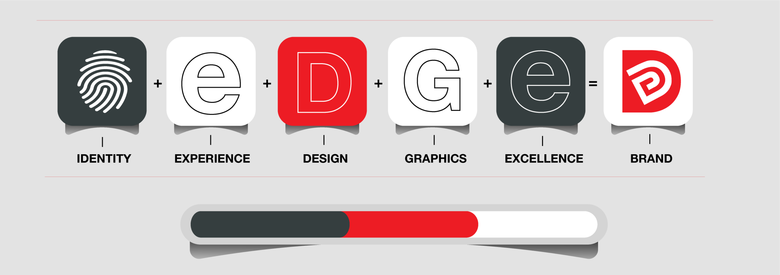
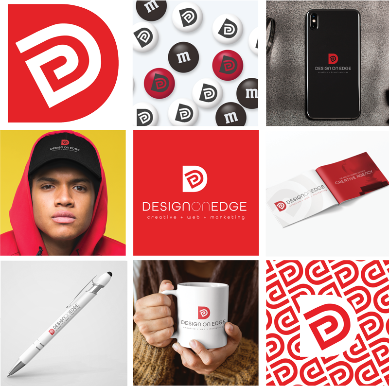
We explored a bajillion concepts and were intoxicated by the idea of identities and fingerprints. This led us to our
final logo, where we integrated an outlined, white D within a red capitalized D to be reminiscent of a fingerprint
while spelling out the word “edge.” (We promise you’ll find it if you look hard enough!) We maintained our
signature red, essential to us since our genesis. Its expression of youthfulness, energy, confidence, determination,
excitement, and boldness continues to express our passion as creatives. We’ve upgraded our letter mark to be
capitalized and included our services in lowercase for contrast. We also introduced a new font: All Round Gothic
from Adobe. Its aesthetic is clean and geometric, and its curves help express the values of our company.
Though we’ve experienced an eventful four years, we’re still committed to challenging ourselves creatively, using
our platform to initiate real defining change within our community, and being open to whatever opportunities
present. With a fresh new brand and logo, we’re excited for the future and ready for whatever the next few years
have in store for us.
